
Problem
People with chronic disorganization often don’t know how to start decluttering their homes and workspaces. They feel overwhelmed and struggle to find time for organizational efforts, negatively impacting their mental health and productivity.
Context
My initial research showed a real need for organizing services, but no successful organizing expert database or similar product currently exists on the market.
According to a study in the Journal of Environmental Psychology, Fifty-four percent of Americans are overwhelmed by clutter, and 78% percent of them aren’t sure what to do with it.
Some of the psychological effects of clutter include:
Stress & increased cortisol levels;
Feelings of shame or inadequacy; and
Distracted focus and decreased productivity.
Everyone can benefit from expert guidance, especially when tackling the challenges of disorganization. While how-to videos may offer some tips, they often lack the personalized support needed to effectively address individual needs.
Solution
A mobile-first web app that connects individuals facing chronic disorganization with expert organizers who can guide them through the decluttering process.
By offering non-judgmental, accessible and flexible support, it will help users overcome feelings of overwhelm, find the time to organize, and ultimately improve their mental health and productivity.
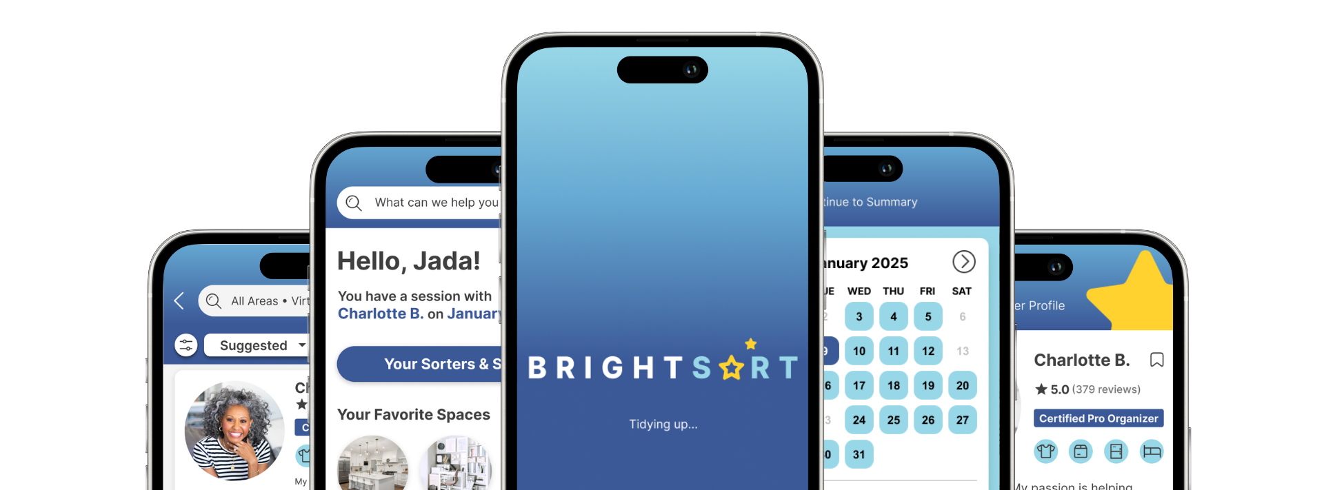
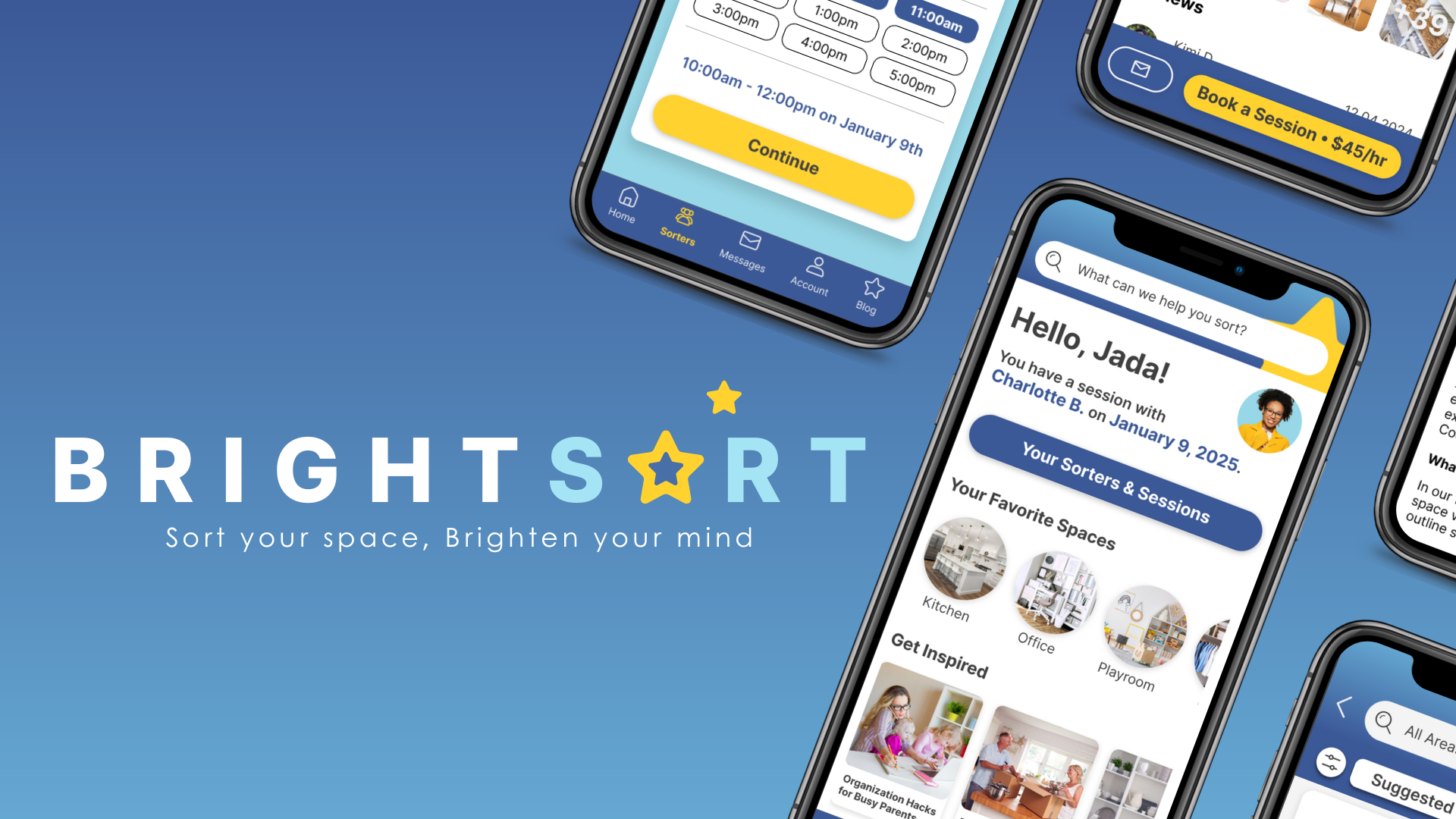
BrightSort was born as an answer to the clutter conundrum.
The BrightSort app aims to provide a straightforward, intuitive platform that connects users with professional organizers in real-time, empowering them to feel more informed and equipped to reclaim their spaces and enhance their productivity.
As a mobile-first web app, BrightSort simplifies access to expert professional organizers - or Sorters - enabling people to easily book affordable, virtual or in-person decluttering and organization services for their home or business, empowering them to reclaim their space and boost productivity.


UNDERSTAND
Analyzing Adjacent Players
Since BrightSort has no direct competitors, I decided to explore adjacent products that potential users might consider when seeking help with organizing and decluttering.
This approach not only helped me understand the landscape but also identified opportunities for differentiation.
I started with a broad list of 13 products and narrowed it down to two key players: Thumbtack (an app) and Find My Organizer (a website).
For each, I developed comprehensive competitor overviews, marketing profiles, and SWOT analyses to assess their strengths, weaknesses, opportunities, and threats.
It quickly became evident that Thumbtack was the stronger competitor - especially due to its high customer satisfaction rates. This drove me to dive deeper into Thumbtack’s user experience by conducting a thorough user experience analysis.
⭐️ My goal → Extract ways to make BrightSort shine brighter.

The Thumbtack user experience analysis examines usability, layout, navigation structure, platform compatibility, differentiation, and calls-to-action. These insights allowed me to integrate competitive findings with user research that would later inform my initial wireframes and prototypes.
This strategic approach not only positioned BrightSort to thrive against potential competitors, but also raised intriguing questions about what users truly want.

EMPATHIZE
User Research: Goals with Purpose
Let’s explore the user research process that played a crucial role in my design strategy. In order to keep the user at the center of the research, I established 4 research goals:
Understand the users’ current pain points and challenges when it comes to decluttering and organizing their spaces, whether it's at home or in their business. Identify common obstacles, frustrations, and unmet needs.
Explore the users’ motivations, triggers, and desired outcomes for seeking professional organizing services. Determine what could compel them to use a virtual app-based solution versus other, more traditional options
Investigate users’ preferences and expectations around the types of expert organizers they would like to be connected with, such as specializations (e.g. residential vs. commercial, specific room/space types), years of experience, certifications, customer ratings, and pricing tiers. Determine how these factors influence their selection and trust in the organizing service.
Identify any unique requirements, constraints, or concerns the users might have - such as privacy, security, scheduling flexibility, or the need for specialized expertise (e.g. for small businesses, hoarders, or individuals with disabilities).
Voices That Shaped BrightSort
Ready to hear from the voices that shaped BrightSort? In order to meet my research goals, I conducted a survey and interviews with potential users.
I developed the survey using Google Forms. I chose this platform for its user-friendly interface and the advantage of unlimited respondents, along with its automatic response analytics feature, which makes data analysis straightforward.
Then, I shared the survey in the CareerFoundry Slack group and the r/SampleSize Reddit group, ensuring a diverse range of feedback from potential users.
Read the Survey Script & Questions Here
Narrowing my focus to participants who struggle with disorganization, I interviewed three participants over three days, conducting two interviews in-person and one via video chat.
Using open-ended questions aligned with my research goals, I was able to encourage authentic responses and to ask follow-up questions, revealing deeper insights beyond what the survey provided.
To fully engage and empathize with my participants, I utilized Otter.AI to record and transcribe our conversations. This allowed me to focus on moderation while capturing valuable feedback.
Read the Interview Script & Questions Here
Research Analysis
To analyze the data and insights gathered from the survey and interviews, I created an affinity map in Figjam. I organized the information into categories aligned with my research goals to reveal patterns and connections that would inform my next steps.
What emerged from this analysis revealed some surprising trends that highlighted the emotional weight of users' challenges, enabling me to create solutions that directly address their needs.
Key Research Insights
Building on the key research insights, I developed user personas to represent the diverse needs and motivations of BrightSort’s target audience.
Guided by User Personas
I combined the key goals, pain points, and behaviors of research participants to create two user personas - Jada & Miguel.
⭐️ My goal → Leverage these personas as guiding stars to help me keep the users at the center of my design process.
Jada: The Stressed Sentimentalist
Jada represents the many potential users who feel overwhelmed by the clutter in their homes, and have a difficult time getting rid of things. Her primary obstacles to organization are finding time as a single working parent and not knowing where to start.
Jada is seeking a convenient and affordable solution to help get her living space in order to prepare for a major life event - moving with her three children. Jada is self-conscious of her messy home, and would benefit from empathetic help.
Miguel: The Resolute Rationalist
Miguel is a representation of potential users who struggle to keep paperwork and digital files in order. As a busy professional, Miguel values efficiency and is frustrated by all the time he wastes at work because of his digital disorganization and piles of paperwork.
Miguel needs help creating a scalable organizational system that will help him be more productive at work. He is eager to pay for a subscription service for ongoing organizational assistance, as long as the return on investment is clear.
By aligning the BrightSort app’s features and functionality with these personas, I aimed to ensure that the final product effectively addresses users’ key challenges and delivers a superior user experience, which should lead to higher conversion rates, increased revenue streams, and long-term business success of a viable product.
As I moved into the ideation phase of the project, I empathized with Jada and Miguel to create user stories and journey maps that illustrate the specific needs, interactions and experiences of each persona during their engagement with the BrightSort app.

DEFINE
From Stories to Solutions
Using the information I gathered from user research, competitive analyses, and the functional requirements from the project brief, I wrote user stories that prioritized the most important aspects of each of the BrightSort app’s primary features.
⭐️ My goal → write narratives that will further guide my design choices, keeping user needs at the forefront.
After writing these user stories, I took a step back with Jada and Miguel to visualize the bigger picture. At this point, I decided to shift my focus to Jada, who represents the needs of the majority of research participants.
Let’s take a look at how I used a user journey map to illuminate her path.
⭐️ My goal → to paint a picture of Jada’s full experience as she uses the BrightSort app in order to identify possible pain points in her journey and plot possible solutions aligned with research-backed needs.
According to the associated emotional response, Jada’s most important pain points were:
Difficulty referring back to profiles that catch her attention.
Worries about missing her session because of her busy schedule.
Embarrassment about how the Sorter may react to the state of her home.
My proposed solutions were:
Create an option to save Sorters to lists.
Send optional appointment reminders via email, text, and/or push notifications.
Empathetic, friendly language throughout the app and vetted Sorters.
These solutions could easily be integrated into the primary user objectives and flows, then tested as the app moves towards further iterations.

IDEATE
Designing Seamless Navigation
Building upon the user stories and journey map, I ideated 2 task analyses and user flows based on 3 primary user objectives:
Find a Sorter
Book a Session
Leave a Review
Together the task analyses and user flows allowed me to optimize the user experience and ensure a smooth journey by understanding how users navigate through the BrightSort app.
These flows were the building blocks to the BrightSort sitemap.
Testing Information Hierarchy
Expanding on the user flows, I drafted a sitemap to visually represent the BrightSort app’s structure and navigation.
To ensure the success of its information architecture, I conducted digital closed card sorting with 6 participants on UXTweak.com.
Participants were able to quickly sort the Cards into categories, with an average completion time of 3 minutes and 13 seconds, suggesting that the sitemap’s content organization made intuitive sense.
The majority of participants placed cards into groupings that match the existing top-level categories and navigation structure of the existing sitemap, indicating that the existing information architecture is well suited to support user tasks.

The results from the card sorting study provided strong evidence that the existing sitemap structure was primarily successful.
Optimizing the Sitemap Structure
The card sorting study wasn’t without issues, though!
When it came to resolving site map categorical issues revealed in card sorting, small changes made the biggest difference.
Here’s the breakdown:
Issue 1:
“Upcoming Sessions” lacked categorical alignment
Solutions:
“Sessions” → “My Sessions”
“Upcoming Sessions” + “Session History” → “Upcoming Sessions & History”
Issue 2:
Unclear Section Names
Solutions:
Calendar → “My Calendar”
Booking → “Book a Sorter”
Contact → “Contact Us”
I made these simple name changes in order to give more clarity and user-centric focus to those sections of the app.
By adopting a more personalized and direct tone with the labels, the navigation and information hierarchy becomes more intuitive and aligned with the user's perspective. I hypothesized that this would enhance the user experience of the app by providing a more personalized, action-oriented information architecture.
Sketching the Experience: Navigation & Main Screens
With a solid architectural foundation established through the site maps, I moved forward to bring my ideas to life by sketching paper wireframes, visualizing the user experience in a tangible way.
I used my Rocketbook Matrix noteboook to streamline the upload process and reduce paper waste.
I prioritized designing the home screen, as it serves as the initial touchpoint for users upon logging in and functions as the central hub for primary navigation.
Next, I sketched the primary screens for each of the three main user flows. This approach allowed for early visualization of the user journey and established a solid foundation for subsequent design iterations.


After creating the low-fidelity wireframes, I transitioned to building low-fidelity prototypes, ensuring that the navigation aligned with user needs and facilitating a smoother transition from concept to functionality.
IDEATE
Getting Started with Grids
I began the prototyping phase by creating a 12-point grid system to inform my layout decisions.
Although this case study focuses on BrightSort as a mobile-first product, my scalable grid system with a high divisibility will allow for uniformity on any platform, providing a solid structure for the app to evolve to tablet and desktop.

Low-Fidelity Foundations
I started with the onboarding flow.
⭐️ My goal → to build trust, reduce overwhelm, and minimize users’ start time for using the app.
Next, I built upon the paper wireframe sketches of the main user flows, and added screens to make the flow more thorough for the user to accomplish their goals.


Mid-Fidelity Updates
The aim with the mid-fidelity prototype was to make subtle design updates to establish a visual hierarchy so that users could easily distinguish between elements and focus on key actions.
One of the most significant improvements was to the Sorter’s calendar within the booking flow.
Other mid-fidelity updates included:
Adding even more screens to ensure that the navigation was complete;
Designing basic interactivity such as scrolling, screen transitions, and selection components to enhance usability;
Applying text to basic components, such as buttons, navigation, and instructions; and
Implementing visual effects such as shadows and background blurs to add subtle depth to the design.
Ready to bring my designs to life, I transitioned into high-fidelity prototyping, refining every element while focusing on creating an engaging user experience that would leave a lasting impression.
High-Fidelity, High Functionality
In the high-fidelity prototype phase, I:
Developed more interactive and animated components;
Filled in the gaps by creating copy for the missing text; and
Updated and applied the BrightSort Design System.
⭐️ My goal → to create a visually appealing and functional representation of the BrightSort mobile app, allowing for future user testing and stakeholder feedback.
Let’s take a look at some of most impactful changes and payoffs in each of the 3 primary flows:


Establishing Design Consistency
As I scaled my design to a high-fidelity prototype, I simultaneously created BrightSort’s design system.
Although the design system evolved over time, along with each prototype iteration, I focused on ensuring consistency across all components, enabling a cohesive user experience that reinforces the brand identity of BrightSort.
⭐️ My goal → to create a library of reusable components that would not only speed up development, but also establish a scalable framework, allowing for future enhancements without compromising design integrity.
To achieve this, I developed a comprehensive style guide (seen here) based on design principles, that outlines best practices for implementation and ensures cohesive aesthetics.
Press image to expand.

TEST
Testing for User Satisfaction
In preparation for usability testing, I wrote a test plan and script.
I recruited 6 participants aged 30-65 and conducted moderated usability tests remotely, via Zoom, and in-person in 20-25 minute sessions.
I recorded the sessions with the QuickTime app, while taking notes, paying special attention to participants’ body language and other subtle cues that may not have been detected on the recordings.
⭐️ My goal → to assess learnability, errors, and satisfaction of users as they interact with the BrightSort app’s high-fidelity prototype for the first time.
Usability Test Objectives:
Assess user errors within, and gather feedback about, the app’s navigation.
Can participants successfully find a Sorter for their needs?
Gather feedback about the booking flow.
Do participants understand how to book and pay for a session?
Measure the success rate of leaving a review.
Do participants understand the rating system, and are they able to leave feedback about a session?

Adaptive Feedback Amid Glitches
While usability testing had a challenge, I embraced it as an opportunity to gather valuable insights that helped me refine the design for the next iteration.
ISSUE:
Due to a glitch during remote testing, participant 4 was unable to scroll to the bottom of the prototype using her phone for tasks 2 and 3, which resulted in incomplete tasks.
SOLUTION:
I asked her questions like, “What would you expect to see if you could scroll down?,” and “What should be on the next screen to help you [complete the task]?”
By thinking fast and being adaptable, I was able to gain usable feedback despite this issue.
Usability Test Results
In order to analyze the usability sessions and highlight commonalities, I created an affinity map in which I sorted key findings into categories.
From there, I created a rainbow spreadsheet to:
Further analyze test data;
Rate errors by severity; and
Ideate possible solutions.
After identifying the primary issues, I was ready to plan for improvements!
Prioritizing Usability Issues
I narrowed the focus of the test results analyses to the top 5 issues that arose during usability testing.
I chose these issues based on error frequency and severity according to Nielsen’s Error Severity Rating Scale, as seen on the Rainbow Spreadsheet.
I created a usability test report to communicate these issues and my proposed solutions with stakeholders.
To ensure my proposed solution for Issue 5 - 'Busy Home Screen' - truly resonated with users, I knew more testing was essential, which led me to conduct preference testing for further validation.
Press images to expand.
Preference Testing
I created an unmoderated preference test using Lyssna, and conducted it remotely with 10 participants, including specific tests for a login/signup screen and two variations of the home screen.
⭐️ My goal → to target critical user interaction points and refine the design based on the results.
Here are the resulting iterations:


REFINE
Resolving Primary Usability Issues
The insights gained from the testing phase directly influenced my design decisions for the testing iterations of the high-fidelity prototype of the BrightSort app, as seen below.


Accessibility Adjustments
I optimized the design for accessibility according to the Web Content Accessibility Guidelines (WCAG)3 by adjusting the color contrast and adding alt text throughout the app.
⭐️ My goal → to ensure that everyone can engage with the BrightSort app, regardless of ability.
Accessibility isn't just a design feature; it's a fundamental right.


💡 If I were to do this project again, I’d start with all aspects of accessibility in mind.
By prioritizing accessibility from the outset, I would ensure a more inclusive design process that not only enhances user experience and broadens the project's reach, but also reduces the need for extensive revisions later on; this practice is one I intend to maintain in all future projects, regardless of their scope.
Having established a strong foundation for accessibility, I shifted my focus to enhancing emotional engagement, recognizing that a truly successful design resonates on both functional and emotional levels.
Emotional Engagement Strategies
In this phase, polished the user interface for emotional engagement using personalization, light animation, and emphasizing the brand color symbolism while fine-tuning the style guide and design system.
⭐️ My goal → to create a more engaging and memorable experience that fosters a deeper emotional connection with users, ultimately driving brand loyalty.
I used color symbolism to trigger users’ emotions on the visceral level and establish further trust.
To appeal to users’ sense of belonging, I redesigned the home screen once again to include a personalized welcome message, session notifications, and custom CTAs to nudge users’ towards the next steps in their journey.
The personalization iteration was one of the most impactful aspects for the home screen.
Finally, I applied some light animation in Figma between screens during the onboarding flow, as well as within the Sorter Search feature. The carousel on the main blog screen (previously, the home screen) is animated to automatically rotate through the images and announcements.
Next, I turned my attention to streamlining the flow to the Sorter Profile, recognizing that an engaging experience must also be easy to navigate.
Smarter Flow for Sorter Profiles
In the latest Sorter Profile iteration, I redesigned the screen to enhance user accessibility by positioning the "Book a Session" button fixed at the bottom.
This strategic placement reduces scrolling, declutters the interface, and minimizes users' cognitive load, allowing them to focus on the unique attributes of each Sorter while simultaneously being guided toward booking a session.
⭐️ My goal → to streamline the user booking flow by creating a more intuitive experience that would enhance user satisfaction and encourage engagement, ultimately driving conversions.
Design Collaboration and Finishing Touchess
As I got closer to the project completion, I reached out a few to my UX design peers and my mentor - an expert in the industry - for their feedback on my design.
⭐️ My goals →
to gain diverse designer perspectives;
to identify any potentially overlooked usability issues; and
to validate my design choices.
Let’s take a look at their feedback and my resulting iterations:


Retrospective
As I reflect on the BrightSort project and its many iterations over the span of 5 months, the most significant improvements have been to the navigation, the home page, the Sorter profiles, and to the app’s overall user interface through multiple research-based iterations.
I am most proud of my ability to think strategically and adaptively when faced with challenges - especially as the clock ticks on.
My biggest hurdle was recruiting research participants as a team of one, which taught me the importance of creative recruitment strategies and networking outside of my acquaintances.
One of my key learnings from user testing has been the importance of reading between the lines of what participants are doing and saying to uncover what they actually need. For example, during usability testing, only one participant mentioned the FAQ section of the Sorter profile, but 5 out of 6 participants spent time reading through the frequently asked questions. I used that observation to inform my design decision when addressing the confusion that half of the users had about the meaning of “Certified Professional Organizers.”
Through prototyping, I’ve learned that the simplest solution is often the best solution. With each iteration, BrightSort became less cluttered, and more focused on helping users achieve their own decluttering goals by creating the simplest path forward.
Another key takeaway from this project is the importance of prioritizing accessibility from the outset. This approach fosters inclusivity, enhances user experience, and reduces the need for extensive revisions. I aim to maintain this practice in all future projects to ensure true user-centered design.
Throughout this process, I prioritized the most important elements - navigation, the main user flows, and overall UI - but there is still much to explore. If given the opportunity in the future, I would like to take BrightSort further by:
Refining the blog section through usability testing;
Redesigning the speciality icon popup feature, and improving it through preference testing; and
Scaling the design to other platforms - specifically tablet and desktop.
Ultimately, this journey has reinforced my commitment to continuous learning and innovation, and I am excited to see how these insights will shape my future endeavors.