

Overview (reword)
HAVN is a responsive, intuitive real estate investment app that empowers buyers with data-driven insights, simplifying decision-making for financial security.
Designed with the sophisticated buyer in mind, HAVN is a trusted partner in navigating the complexities of real estate investing.
Problem Statement (reword)
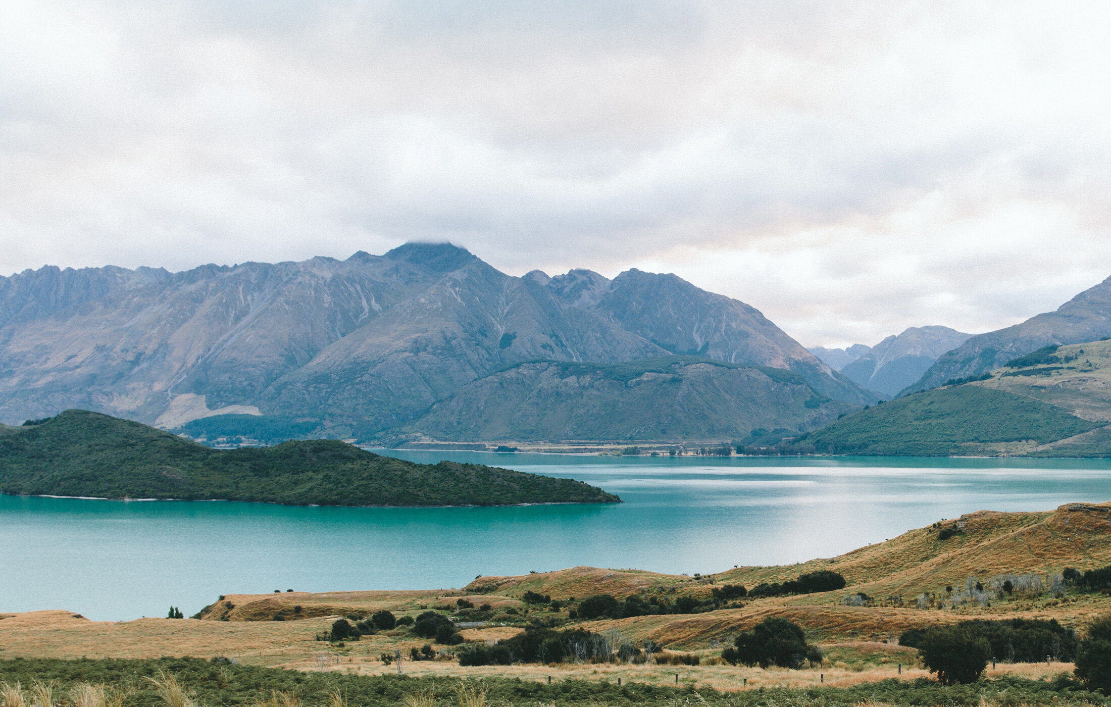
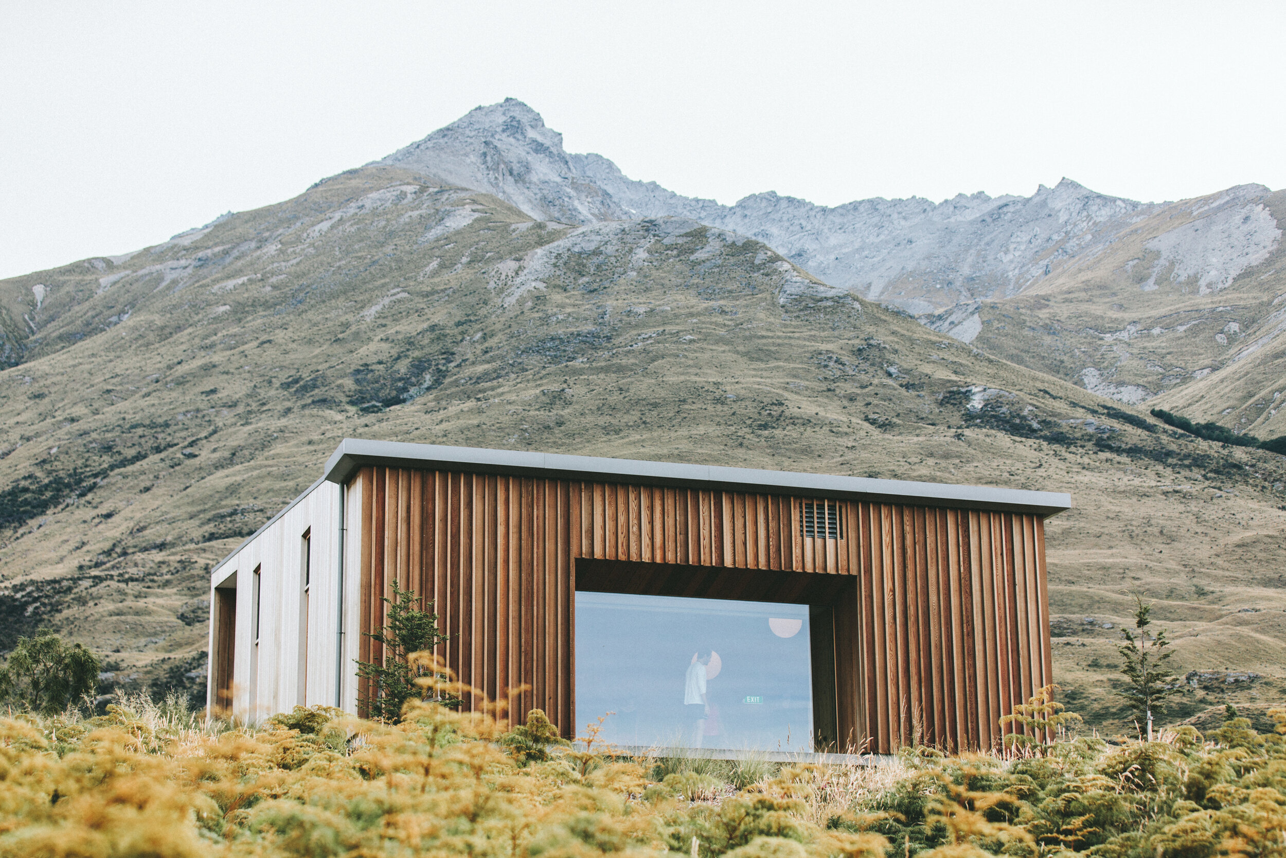
Investing in real estate is one of the most exciting ways to build financial security — but for many buyers, it quickly turns overwhelming.
Information is scattered across blogs and agencies, and without professional guidance, new investors often waste valuable time chasing properties that aren't the right fit.
With HAVN, I set out to change that.
My Design Process (reorder?)


Understand
5Ws Questions (reword)

Research-Backed Objective/Context (reword)
According to a recent study by the National Association of Realtors, over 80% of potential homebuyers begin their property search using a mobile app, with 58% finding the home they ultimately purchased on a mobile device.
With this in mind, I decided to focus on a mobile-first app design.
My goal → to design a sleek, intuitive app that combines simplicity with sophistication, empowering users to make smart, data-driven decisions with confidence while navigating the complexities of real estate investing.

Empathize
Persona (reword)
some brief intro to Rashida


Define
User Flows (reword)
The following user flows were inspired by these user stories and the feature requirements from the project brief.
My goal → to create a navigational structure that makes it easy for Rashida and users like her to quickly find the right investment property and get in touch with an agent.

Ideate
User Stories & Low Fidelity Paper Wireframes (reword)
Focusing on the primary user flows, I sketched low-fidelity paper wireframes using my Rocketbook Matrix to explore the layouts and hierarchy. This allowed me to visualize how the key actions and decisions would flow, ensuring that each step felt intuitive and aligned with Rashida's needs.
My goal → to refine the navigation early on while addressing potential friction points in order to set a solid foundation for future iterations.


Mid-fidelity Wireframes (reword)
As I transitioned from low-fidelity to mid-fidelity wireframes, my primary focus was to refine existing UI design patterns while adding new ones.
My goal → to create a consistent and intuitive experience for Rashida and users like her.
I accomplished this by doing some informal competitive research via apps like Realtor, Zillow, and Trulia, selecting recognizable design patterns, cross-referencing them with commonly recognized UI patterns, and adjusting them for the HAVN app.


Mood Boards (reword)
Before diving into high-fidelity design, I created two distinct mood boards — each inspired by the project’s objectives and vision. Then, I analyzed them down to find the strongest fit: the one that aligns best with the brief and would resonate with users like Rashida.
Mood Board #1 has a clean, minimalist and functional aesthetic. I was inspired by light and airy Scandinavian interiors that effortlessly balance function and form.
The blue-infused color palette is meant to inspire feelings of trust and tranquility. This peaceful palette is like coming home to a relaxing and familiar space. It reflects the emotional reassurance users seek when making high-stakes decisions like property investments.
The logo image features geometric buildings with an almost-hidden “H” in the center.

Mood board #2 has an intuitive, smart, and relevant feel with a modern, high-contrast aesthetic. I was inspired by the natural world and timeless innovation.
By pairing earthy greens with bronze tones in the color palette, I aimed to balance warm and cool colors while representing growth and strength. The almost-black elicits a feeling of actionable power, while the pale Isabelline color adds a hint of understated timelessness.
The logo relies on the Gestalt law of closure to represent a bold, pentagonal house shape with a stylized H inside.

While these two moodboards share some sisterly similarities, Mood Board #2 stood out as the right choice for HAVN.
It evokes stronger feelings of financial growth and long-term stability. The earthy tones offer Rashida a sense of familiarity, reflecting her love of weekends spent in the countryside. The strong, contrasting neutrals also mirror the fast-paced, on-the-go lifestyle she leads.
It’s a palette that speaks to both ambition and reassurance—exactly the tone HAVN needs to earn trust and inspire action.

Prototype
High-Fidelity Mobile Screens (reword)
Something to introduce this section.
My goal → to
Something here too.


Dark Mode (reword)
In 2025, nearly 82% of smartphone users prefer dark mode.
It’s a smart choice too: utilizing dark mode can reduce battery consumption by an average of 67%, a big plus for users like Rashida who need reliable access on the go without always having a charger handy.
My goal → to ensure that users can customize their experience for both aesthetics and practical use - especially when encountering varying lighting conditions - by choosing light or dark mode.
Interactions (reword)
Staying true to the theme of personalization and Rashida’s need for quick, data-driven decisions, I designed a range of interactive components and pickers that help her fine-tune property search results with ease.
Animation (reword)
Drawing from the HAVN mood board, I created a smooth, animated transition between the personalized onboarding and home screen.
This gives users clear feedback that their inputs are being processed, while keeping the experience flowing seamlessly.
My goal → to improve user experience by reducing perceived wait time with branded animations on loading screens.

Test
Preference Test for Property Pins (reword)
At this point in the project, I decided to conduct a remote preference test using Lyssna for the property pins using Lyssna.
My goal → to step outside of my bias to determine the most user-friendly color combination.
This quick test gave me actionable insights without disrupting momentum—an efficient way to validate design decisions with real user feedback.

The results were almost unanimous, with 90% of participants preferring the moss and champagne color combination, giving me the clarity to move forward with confidence.


Based on the results, I updated the property pin design to better meet user preferences while supporting the app’s sleek, modern aesthetic. Refining these small but impactful details not only enhanced usability, but also set the tone for the visual consistency carried through in the style guide.
Refine
Branding / Style Guide Sample (reword)
HAVN’s interface pairs intuitive design with a modern, high-contrast aesthetic—rooted in quiet luxury and built for clarity, confidence, and long-term value.
This foundation shaped the entire style guide, guiding thoughtful decisions around visual hierarchy, consistency, and the kind of polish that earns user trust.
My goal → to develop a refined visual identity for HAVN that enhances the user experience by instilling a sense of confidence and sophistication, making every interaction feel premium and purposeful.
With responsiveness at its core, the style guide translates HAVN’s refined aesthetic into a flexible system that scales effortlessly across devices while maintaining a polished, cohesive feel.


Responsive Screens
As I approached the final stages of the design, optimizing the design for responsiveness was a key priority.
My goal → to ensure that users would have a smooth, intuitive experience whether they’re on a phone, tablet, or desktop.
I started by sketching low-fidelity tablet and desktop screens in my Rocketbook Matrix, and translated them into high-fidelity wireframes in Figma.
I finished by fine-tuning the design at every breakpoint to maintain smooth navigation and a clean design to help users achieve their goals of finding the perfect investment property, no matter the screen size.
Retrospective
xx