

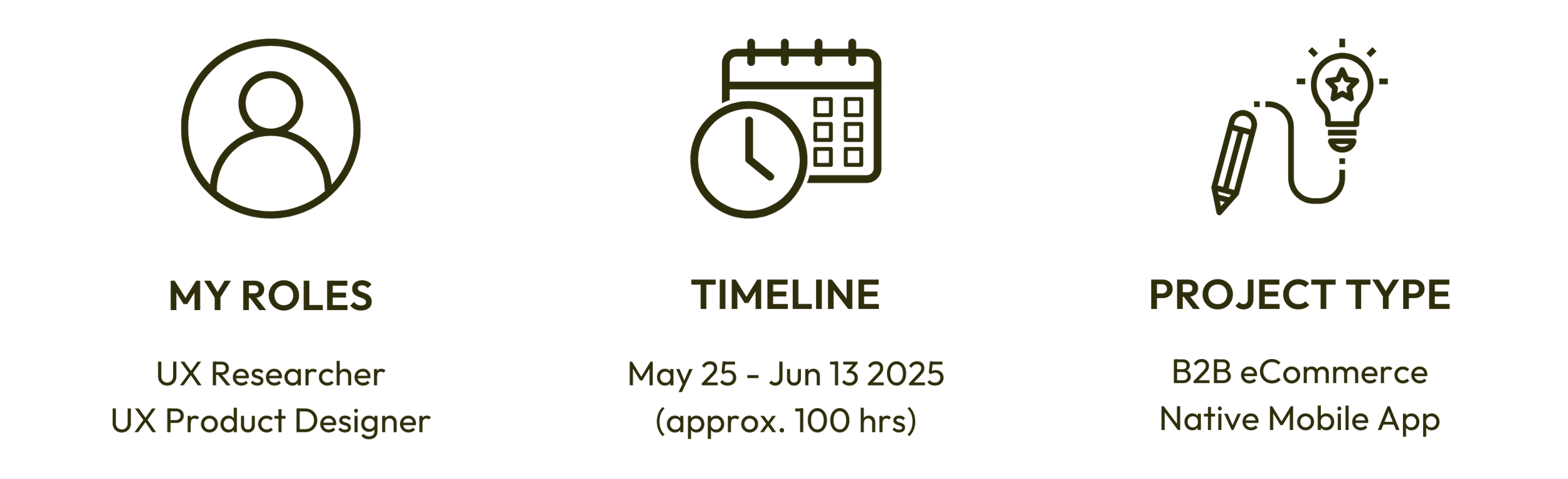
The Problem: A Desktop Tool in a Mobile World
Printify sellers want to manage their stores from anywhere, but without a mobile app, they’re left using a desktop-optimized browser site that’s frustrating and inefficient on mobile devices.
Printify’s Mobile Opportunity
Printify is a cloud-based platform that helps over 12 million entrepreneurs and small businesses create and sell custom-printed products without managing inventory or fulfillment. It connects merchants to a global network of 85+ print providers and integrates with platforms like Shopify, Etsy, and WooCommerce.
While Printify’s desktop tools support robust store management, mobile usage now makes up nearly 40% of traffic, a number that’s only growing. In an era where B2B mobile commerce is projected to reach over $57 trillion by 2030 (Grandview Research), Printify users are asking for ways to manage their business on the go.
This case study explores what a mobile-native experience could look like for Printify sellers, many of whom run their businesses from anywhere, often solo.
A Solution Built for Sellers
To address the lack of a mobile-native experience, I designed a streamlined B2B mobile app concept tailored to the needs of Printify sellers.
Grounded in real user frustrations and business goals, the solution is focused on creating a dashboard experience optimized for quick access, simplified order management, and seamless on-the-go workflows. This case study walks through the research, design decisions, and user feedback that shaped the final prototype.
This is not a redesign. It’s a strategic leap toward making Printify as agile as the entrepreneurs who use it.
How I Turn Problems Into Products

Understand
The Shift Driving B2B Mobile Innovation
While mobile-first design has long been standard in B2C e-commerce, B2B platforms are quickly following suit as buyer expectations shift. Today’s decision-makers are increasingly mobile-savvy, using smartphones and tablets to manage operations, place orders, and track fulfillment. With mobile set to drive 63% of all e-commerce sales by 2028, the need for seamless, user-friendly mobile experiences has never been more critical, even in traditionally desktop-first B2B tools.
For a platform like Printify, whose primary users are small business owners often managing tasks on the go, meeting these expectations isn’t just a nice-to-have. It’s essential.
These broader shifts in digital commerce laid the groundwork for exploring what a true mobile-native Printify experience could become.
Misalignment of Core Values and User Needs
Printify proudly centers its brand around one core value: “The customer is our compass.”
The company emphasizes listening to users, improving continuously, and building tools that help entrepreneurs succeed—especially those juggling the demands of running a business solo or on the go. With over 12 million users ranging from side hustlers to seasoned e-commerce sellers, Printify’s promise is to empower them with scalable tools that remove barriers and make print-on-demand accessible from anywhere.
But despite this mission, there’s a growing disconnect between those values and the user experience on mobile.

In researching this project, I uncovered more than four years of customer requests for a native mobile app across Facebook and Reddit communities. Many echo frustration with the clunky, desktop-optimized browser experience on phones. These weren’t one-off complaints, but repeated, high-engagement threads from users who rely on mobile access to manage their stores in real time.
This gap between Printify’s stated priorities and the mobile experience became the driving force for this project.

Empathize
Laser-Focused Research
To design an app that truly supports Printify sellers, I needed to understand their pain points and how they currently manage their businesses while on the go.
I wrote these goals to guide my research approach and help me focus on what matters most to users managing their businesses away from a desktop.

Pivoting My Approach
Empathy was at the core of this project from day one. I initially launched a survey using Google Forms to gather insights, posting it across four Facebook and Reddit communities. After 24 hours, I had only one response. Two posts were even flagged as spam.
Rather than lose momentum, I pivoted quickly. I shifted to a more conversational approach, engaging directly with users in active threads and comments across relevant communities like PODfriends (19.9K members), Printify Print on Demand Rockstars (41.2K members) and r/Printify (20K members).

This shift created space for more honest, natural conversations.
As a Printify user myself, I could connect easily with others, but I made sure to stay objective and center the perspectives of other sellers. These informal dialogues proved far more valuable than my original survey, surfacing nuanced frustrations, unmet needs, and patterns that might have otherwise gone unnoticed.
The Users Have Spoken


Observations from Community Feedback
I reviewed 52 community posts, including 43 existing threads and 9 of my own, and engaged with dozens of Printify sellers across Facebook and Reddit. In just two days of conversation, I uncovered key behavioral patterns that highlighted the friction users face when managing their stores away from their desktop.
People have found workarounds
Bookmarking, using iPads, manual approvals on desktop - signs that current mobile options aren’t frictionless
There’s a divide in usage
Quick tasks are mobile-friendly enough, but more complex tasks are consistently punted to a desktop.
The few users who aren’t craving a new app, are not because they don’t expect one to work better
An unmet expectation worth exploring
Synthesis: Emerging Themes & Patterns
To deepen my understanding, I organized user quotes into an affinity map to identify themes and patterns across conversations to uncover what users want. Through the affinity map, I uncovered meaningful insights that could inform a mobile experience rooted in real user needs.

Pattern: Many users want a dedicated, purpose-built mobile app instead of using the mobile browser or the Android app that behaves like one. They want fast access to core order management features.

Pattern: Logging out too frequently, CAPTCHA frustration, and lack of persistent sessions are major usability blockers. These issues seem to compound user dissatisfaction and waste time.

Pattern: Many users find mobile functionality clunky, unintuitive, or outright unusable for anything beyond checking orders. The browser experience creates friction and leads some users to avoid mobile entirely.

Pattern: Even mobile-leaning users often reserve tasks like artwork placement, uploading, or customization for desktops or large-screen devices because of precision, visibility, and comfort.

Pattern: Some users are openly comparing Printify to competitors and indicating they would switch (or already have) due to lack of a proper app, poor customer service, or broken features. There’s a risk of attrition here tied directly to UX.
Meet the Everyday User
My primary persona, Morgan, an illustrator who sells personalized designs, emerged from early research and candid conversations with real Printify users. She represents the core needs, frustrations, and motivations that shaped this project moving forward.

Define
Centering User Needs
Drawing from Morgan’s pain points and repeated patterns in user feedback, I identified five key needs that reflect what Printify users value most in a mobile experience:
Persistent login with secure session management
Quick-access dashboard for current orders, statuses, and actions
Reliable notifications (order updates, errors, Printify changes)
Mobile-optimized UI with touch-friendly controls and simplified flows
Complete key tasks with orders while on the go
To keep the users’ voice central, I translated these needs into user stories that capture what success would look like for them in a native mobile app.
Mapping Movement in the Current Mobile Experience
To better understand the friction points users face, I mapped out a typical Printify seller’s experience managing orders through the browser-based site on mobile. This journey map helped me visualize the most frustrating moments in the current flow and identify opportunities for a smoother, more intuitive native app experience.
This journey map below, I captured the current state of the browser-based mobile experience and proposed targeted improvements for a native mobile app aligned with the user needs defined in the previous section.

Ideate
Turning Tasks into Frictionless Flows
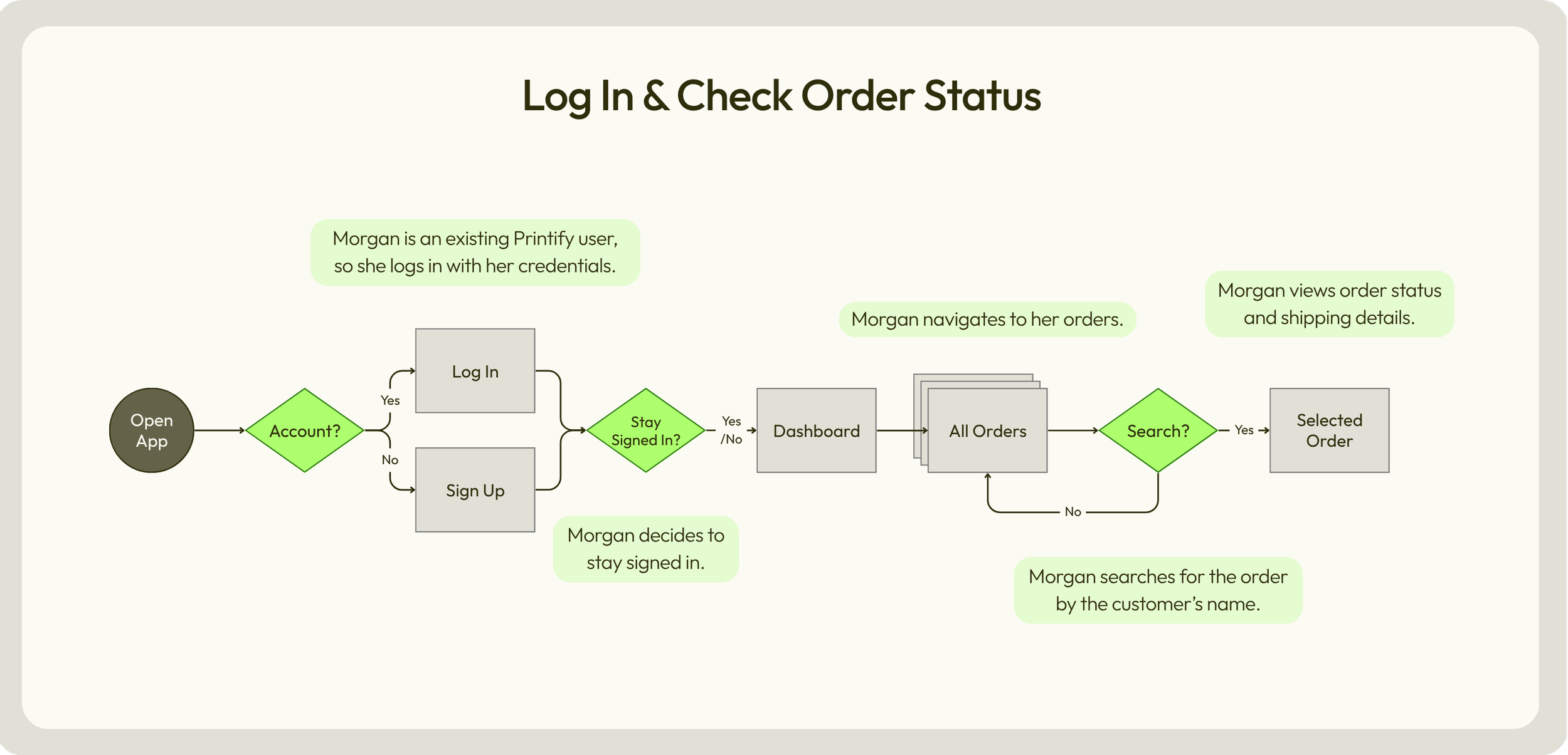
To begin shaping the app’s structure, I broke down three essential workflows that users need to complete while on the go:
1. logging in and checking order status,
2. manually submitting an order, and
3. creating a new order.
These task analyses and user flows helped me clarify the critical steps and reduce friction, guiding early navigation decisions to support fast, intuitive access to high-priority actions.


Structuring for Seamless Navigation
I created this mobile sitemap to support Morgan’s core workflows without all the back-and-forth. It’s not a smaller version of the desktop experience, but a restructured path that helps her move smoothly between managing and creating orders on the go.

Initial Ideas in (Erasable) Ink
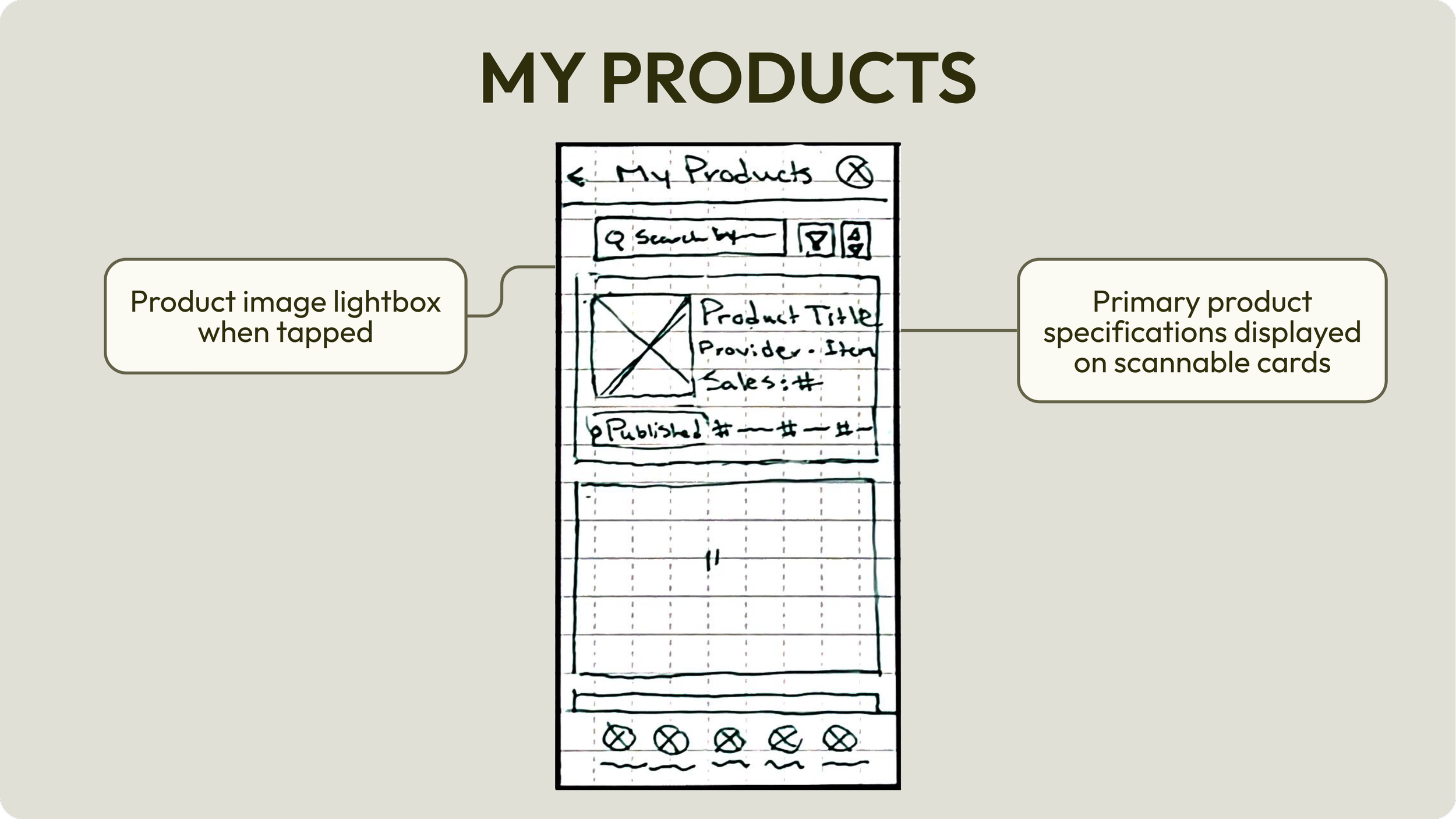
I started to visualize the app by sketching five core screens in my Rocketbook Matrix to quickly explore layout and flow. I kept things clean, task-focused, and aligned with Printify’s branding while leaning into mobile-first best practices.


Prototype
From Paper to Purposeful Mid-Fidelity
As I moved from paper to mid-fidelity, I used the sitemap and user flows as my blueprint, making sure every screen supported core tasks with clarity and ease.
Notable improvements from the browser-based mobile view:
Touchpoint upgrades: 32px → 40px primary buttons, 48px minimum throughout
Font sizing for readability: 14px → 16–18px body text
Persistent CTAs: Floating or fixed call-to-action buttons to streamline task completion
Bottom navigation bar: With a central focus on order actions
New feature: “Report an issue” added directly to the order detail screen
Product visibility: Larger thumbnails for faster recognition
Stepped flow for new orders: Helps users stay accurate and efficient on the go
Sticky search bar: Always within reach, reducing effort
Reduced scroll load: For faster navigation and less fatigue


High Fidelity: Refining Visuals and Interaction
With the high-fidelity prototype, I brought clarity, cohesion, and efficiency to Printify’s mobile experience, without straying from the brand’s visual identity.
This clickable prototype reflects everything I uncovered in research: the need for consistency, efficiency on the go, and frictionless workflows for busy sellers.
For this iteration, I:
Unified the visual language across radio buttons, checkboxes, and other pickers
Introduced thoughtful icon updates, including a new filter icon and duo-toned footer nav for clarity
Created custom color and size pickers designed for speed and precision
Added helpful loading screen copy to reduce uncertainty during wait times
Kept the core UI visually aligned with Printify’s existing platform—so it feels native to longtime users but functions far better on mobile


Test
Putting the Prototype to the Test
I conducted moderated usability tests of the high-fidelity prototype with 5 participants (4 remote, 1 in-person) in 15 minute sessions to see how well my design holds up in real-world scenarios.
I used Otter AI and QuickTime to capture the sessions, so I could focus on live note-taking and pay close attention to unspoken cues like hesitation and body language as participants completed these tasks.

Participants Speak Out
Behavior Breakdown: Finding the Patterns
To make sense of the feedback, I used both an affinity map and a rainbow spreadsheet to track patterns across sessions.
Combining these methods helped me pinpoint common behaviors and surface the most critical usability issues so I could refine with purpose in the next phase.

Prioritizing Issues and Next Steps
To guide meaningful improvements, I prioritized the top four usability issues based on frequency and severity using Nielsen’s Error Severity Rating Scale.
Each issue revealed an opportunity to clarify, streamline, or better align the interface with what users actually expect. These key findings, as documented in the rainbow spreadsheet, directly informed my refinement plan, which focused on tightening up microcopy, reinforcing feedback, and reducing interaction friction in the areas that mattered most.

Refine
From Feedback to Final Touches
Every refinement I made was grounded in user feedback and guided by the goal of delivering a smoother user experience to increase satisfaction and build confidence in the Printify brand.
I focused on clarifying actions, reinforcing feedback, and improving scannability, especially in task-critical flows like order creation and approval. Microcopy, hierarchy, and visual cues were fine-tuned to reduce hesitation and support quick decision-making.
These changes not only addressed usability pain points, they aligned the mobile app more closely with both user behavior and Printify’s business goals.


Reflection
Researching and designing for this native mobile app concept gave me a front-row seat to the disconnect between user needs and Printify’s current browser-based mobile experience.
While I didn’t have access to a recruitment panel or internal analytics, I made the most of what I had. I leaned hard into public conversations and community knowledge to surface real frustrations and identify clear opportunities. In a professional setting, I’d build on this by tapping into in-house data, partnering with stakeholders to define KPIs early, and conducting structured usability sessions with target users across multiple platforms.
This project pushed me to find the sweet spot between brand alignment, mobile-first design patterns, and business outcomes. Every decision, from simplifying order flows to improving visual hierarchy, was made to reduce friction for users like Morgan while supporting the goals of customer retention, faster order processing, and brand trust.
If I were to continue, I’d love to:
Explore how elements of this mobile-first redesign could improve the desktop experience as well
Prototype additional features users hinted at, like bulk actions and real-time support
Collaborate with developers to prioritize accessibility and performance in production
Conduct A/B tests on the refined flows to validate design ROI
This project wasn’t about reinventing Printify, but rather designing a version that fits into users’ lives without slowing them down.
When users don’t have to fight the interface, they can stay focused on growing their business. That’s a win for Printify’s business too.

Disclaimer: This case study was created as a personal, educational project and is not affiliated with or endorsed by Printify. Any trademarks and brand assets remain the property of their respective owners.