
My Framework for Tackling Complex Product Problems
Making Sense of the Mess
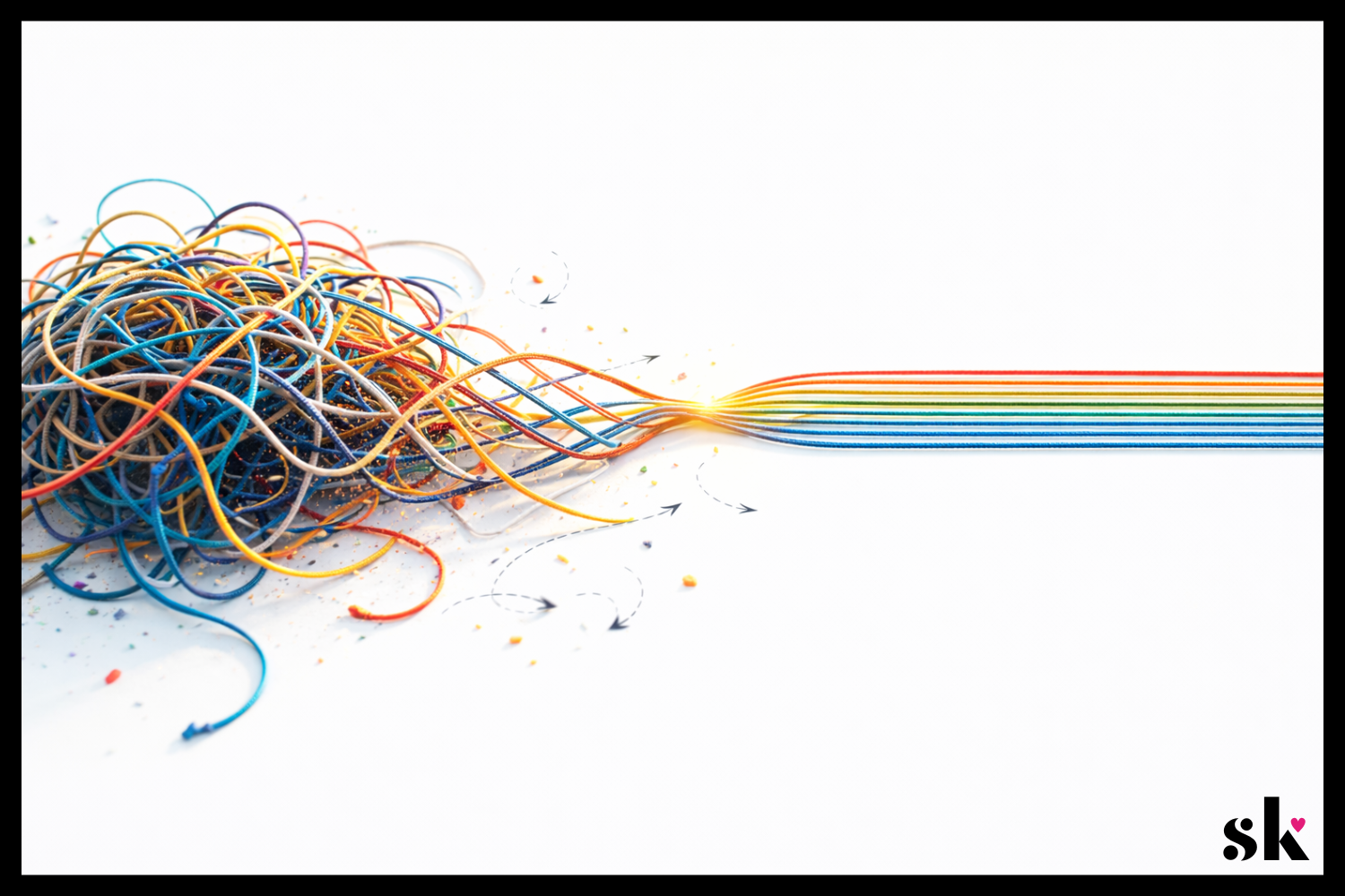
Complex product problems rarely arrive neatly packaged. They usually show up messy, vague, and full of competing priorities. The product team wants growth. The business wants revenue. Users want something simple that works. Meanwhile, the designer is staring at a problem that feels less like a design task and more like a tangled ball of yarn.
If you’ve ever opened a project brief or walked out of a client meeting and thought, “Where do I even start?” you’re not alone.
Product design often gets framed as creativity. And it is. But more often than not, great product design is really about structured thinking. It’s about taking a complicated situation and slowly bringing clarity to it. Piece by piece. Decision by decision.
Albert Einstein once said,
“If I had an hour to solve a problem, I’d spend 55 minutes thinking about the problem and five minutes thinking about solutions.”
Whether or not he actually said it exactly that way, the idea holds up. The better you understand the problem, the easier the solution becomes.
Over time, I’ve developed a simple mental framework that helps me approach complex product problems without getting overwhelmed. It isn’t rigid, and it definitely isn’t the only way to work. But it’s a reliable way to move from ambiguity to clarity.
Here’s how I typically approach it.
1. Clarify the Goal
The first step in solving a complex product problem is surprisingly simple. You make sure you actually understand the goal.
This sounds obvious, but it is also one of the most common places teams go wrong. A project might begin with something like “improve the experience,” “increase engagement,” or “modernize the interface.” Those are directions, not goals.
As a designer, my first instinct is usually to slow things down and ask questions. What exactly are we trying to improve? What does success look like? What behavior should change if the design works?
Often, the first version of the goal is really just a surface-level description of a deeper issue. For example, a request to “increase engagement” might actually mean users are confused about how to complete a task. Or a request to “simplify the interface” might really mean support tickets are increasing.
This is where reframing the problem can be powerful. Instead of designing immediately, I try to articulate the goal in a way that connects user behavior to measurable outcomes.
A clearer goal might look something like:
Help new users successfully complete their first task.
Reduce friction in a key workflow.
Increase trust during a financial decision.
Once the goal is specific, design decisions become much easier to evaluate. Every idea can be measured against the same question: Does this move us closer to the goal?
Clarity at the beginning saves an incredible amount of time later.
2. Identify User vs Business Outcomes
One of the most interesting tensions in product design is the relationship between user outcomes and business outcomes. They are often connected, but not always perfectly aligned.
A good product designer has to navigate both.
Users typically want clarity, efficiency, and confidence. Businesses want growth, retention, and revenue. The magic happens when you find solutions that support both sides at the same time.
For example, if a checkout flow is confusing, users may abandon their purchase. Improving the clarity of that experience helps users complete their task more easily, while also improving conversion for the business. Everyone wins.
This connection became especially clear to me while running my own design-focused e-commerce business. When you are responsible for both the product and the business side, you quickly learn that design decisions have real consequences. A confusing product page can mean lost sales. A clear one can build trust and increase conversions.
That experience reinforced something I now carry into product design work. The goal is not to choose between user needs and business needs. The goal is to design solutions where those outcomes reinforce each other.
When evaluating a design direction, I often ask two questions:
Does this make the user’s experience easier or more enjoyable?
Does it support the product’s broader goals?
If the answer to both is yes, it is usually a strong signal that the design is moving in the right direction. It really can be that simple.
If you’d like to take a deeper dive into balancing user needs with business priorities, check out this post.
3. Define Constraints
Constraints sometimes get a bad reputation in design conversations. People tend to think of them as limitations that prevent creativity. In reality, constraints are often what make great solutions possible.
Without constraints, the design space becomes so wide that it is difficult to know where to begin.
Constraints can come from many places. Technical limitations. Regulatory requirements. Time constraints. Existing design systems. Stakeholder priorities. Accessibility considerations. Each of these shapes the environment the product lives in.
Instead of seeing these factors as obstacles, I try to treat them as part of the design problem itself.
For example, if a product must integrate into an existing system, that constraint becomes a design input. If development resources are limited, the solution may need to prioritize the highest-impact improvements rather than a complete redesign.
Ironically, working within constraints often leads to more focused, creative solutions. It forces the designer to think carefully about what truly matters.
A helpful mental shift is to ask: Given these constraints, what is the best possible experience we can create?
This mindset turns limitations into creative challenges. It also keeps the design grounded in reality, which is essential when working in complex product environments.
Great design is rarely about designing in a vacuum. It is about designing effectively within the world the product actually lives in.
4. Explore Multiple Solution Paths
Once the problem is clearly defined and the constraints are understood, it’s finally time to explore solutions.
One of the biggest traps designers can fall into is falling in love with the first idea that appears promising. I’ve been guilty of this in the past. Our brains love early certainty. Unfortunately, complex product problems rarely reward it.
Instead, I try to deliberately explore multiple directions before committing to one. This helps avoid the “single-solution tunnel vision” that can limit creativity.
At this stage, the goal is not perfection. It is exploration.
Sometimes that means sketching several different approaches to the same workflow. Other times it means experimenting with different interaction patterns or levels of guidance for the user.
When working on a mobile concept for Printify's platform, for example, I explored several different ways to support the core tasks sellers needed to complete. The research showed that users primarily wanted to check order status, manually submit orders, or create new ones while away from their desktop. I experimented with different navigation structures and flows to support those actions, including how quickly users could access orders from the dashboard and how guided the new order process should be. Exploring these directions made it easier to evaluate tradeoffs and prioritize the fastest, most intuitive paths before committing to a final structure.
This process also helps reveal assumptions hiding inside early ideas. When you compare several approaches side by side, you begin to see which elements actually solve the problem and which ones simply felt familiar.
A simple rule I like to follow is this: if I only have one idea, I probably have not explored enough yet.
Exploring multiple paths creates better conversations, stronger solutions, and ultimately more thoughtful products.
You can see my full Printify case study here.
5. Test Assumptions & Iterate
Every design decision carries assumptions. Sometimes we are aware of them. Sometimes we are not.
Maybe we assume users understand a particular icon. Maybe we assume they will follow a certain workflow. Maybe we assume a feature will solve the problem because it makes sense to us.
The challenge is that assumptions can feel very convincing inside a design file.
This is where testing becomes incredibly valuable.
Testing does not always need to be elaborate or time-consuming. Even lightweight usability sessions can reveal surprising insights. Watching someone interact with a prototype often uncovers friction points that were invisible during the design process.
One of the most humbling parts of usability testing is how often users interpret things differently than expected. A label that seemed perfectly clear might confuse several participants. A feature that seemed essential might be ignored entirely.
These moments are not failures. They are learning opportunities.
The goal of testing is not to prove that a design is correct. The goal is to learn how real people experience the product.
According to research compiled by the Nielsen Norman Group, testing with as few as five users can uncover a large portion of usability issues in a design. Even small studies can generate meaningful insights.
Testing helps move design decisions from assumptions to evidence. And in complex product environments, that shift can make a huge difference.
Testing is also what makes iteration possible.
The first version of a design is rarely the final answer. It is the starting point for learning. Once feedback begins to appear, the designer has an opportunity to refine the solution.
Sometimes those changes are small. Adjusting microcopy. Improving visual hierarchy. Simplifying a step in the workflow.
Other times, iteration leads to larger shifts. A feature may need to be repositioned. A flow may need to be reorganized. Occasionally, a promising idea turns out to solve the wrong problem entirely.
Iteration can feel frustrating if the expectation is perfection on the first attempt. But when iteration is built into the process from the beginning, it becomes a powerful advantage.
In practice, this usually looks like a simple cycle:
Prototype the idea
Test with users or gather feedback
Identify friction points
Refine the design
Then repeat.
Over time, these cycles gradually transform early concepts into polished experiences.
Testing reveals what needs to improve. Iteration is how the product actually gets there.
From Complexity to Clarity
Complex product design problems can feel intimidating at first. They often involve multiple stakeholders, unclear goals, technical constraints, and users with very real needs.
But complexity becomes manageable when you approach it systematically.
Clarify the goal. → Understand the relationship between user needs and business goals. → Work within constraints. → Explore multiple solutions. → Test assumptions & iterate.
None of these steps are particularly flashy. There is no secret shortcut hiding inside them. But together, they create a reliable path through ambiguity.
At the end of the day, product design is less about having brilliant ideas and more about asking good questions.
The more clearly you understand the problem, the easier it becomes to design solutions that genuinely help people. And honestly, that moment when a complicated problem finally starts to make sense? That’s one of the most satisfying parts of the job.
If this way of thinking about product design resonates with you, I’d love to connect. You can find me on LinkedIn or shoot me a message here.